Reducing invoice resolution time by 67% For Axway E-Invoicing
Axway's legacy e-Invoicing platform suffered from usability gaps due to engineering-led development. As the first designer, I advocated for user research, studied how power users actually worked, and redesigned a core error-finding workflow. The redesign reduced invoice resolution time by 67% in testing.
timeline
4 weeks
team
Product Designer (me), Product Manager, Operations Team, SWE
my role
User Research, Design, User Testing
the product
B2B invoices need to be regulatory compliant, and Axway's
E-Invoicing Solution makes this possible by 1) automating the flow of invoices between enterprises and trading partners, and 2) transforming the invoices during this flow to make them compliant with local regulatory laws.
This is made possible by integrating Axway's e-Invoicing Solution with existing Accounts Payable/Receivable (accounting) products used by enterprises. Once integrated, the process starts by receiving an invoice from a sender (supplier), which is then transformed and processed to be regulatory compliant before being sent to the receiver (buyer).

the users
We had two user groups: the Operations team (power users) and AP/AR accounting professionals (secondary users)

how i got started
Leadership was concerned about growing UX complaints from enterprise users (our secondary user group), especially the younger demographic who were quickly replacing the older enterprise workforce.
As the first designer on an engineering-led team, I had to establish a design process from scratch and earn buy-in from stakeholders unfamiliar with design's value.
To get up to speed quickly, I applied a heuristic lens to the newly developed platform.

Turns out, there were a lot of problems.
conflict
stakeholder alignment
I got the green light to conduct user research, but accessing enterprise users was off the table since the team had previously struggled to recruit them. We focused on our Operations Team (power users) instead.
The goal of this discovery research was simple: learn what tasks users perform on the platform, how they go about them, and what problems they face
research
Through user interviews and observational studies with our power users, I uncovered a few interesting findings
Every failed invoice goes through two stages: Diagnosis and Treatment
Diagnosis is finding which invoice failed and why. Treatment is fixing it.
01.
Operations team is always feeling overwhelmed
~150 invoices fail daily. Resolution delays cause SLA breaches and increase stress.
02.
Diagnosis is repetitive across all failed invoices
The first stage looks identical every time, regardless of why the invoice failed.
03.
Treatment isn't one-size-fits-all, since each failure has a unique cause
Invoices can fail for dozens of different reasons, so each case requires an individual approach.
04.
Operations doubles as support for enterprise users
AP/AR professionals routinely contact Operations to understand failures, despite having portal access.
05.
Converge
problem
The existing Diagnosis flow was tedious, requiring users to navigate through seven screens to find why an invoice failed

ideation
The solution was to cut irrelevant screens and surface key information earlier in the flow
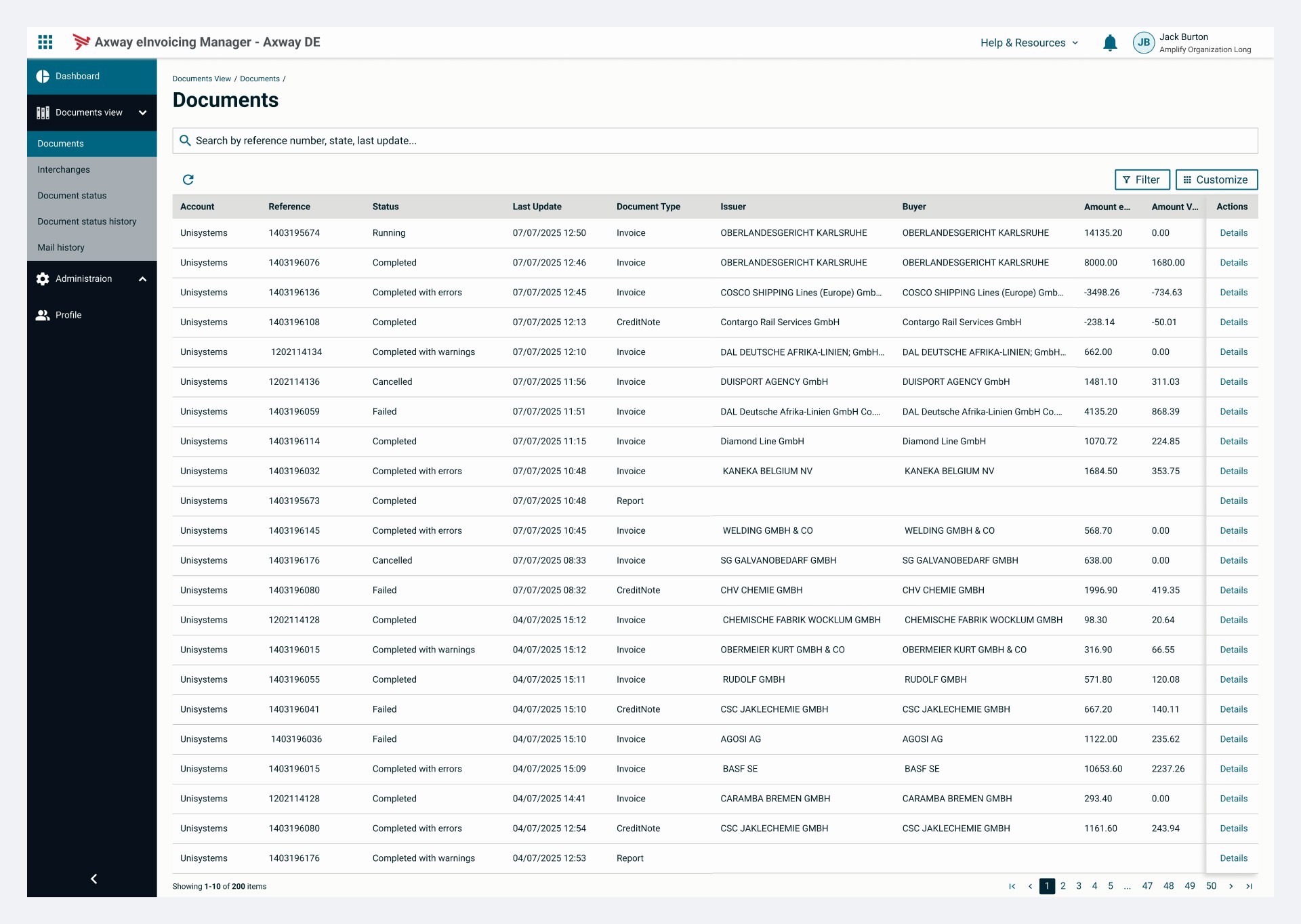
The Documents screen was missing invoice status information, so that needed to be added. The Invoice Detail screen didn't need reworking, we just needed a way to connect both screens.

concern
constraints
The solution had to work within some tight constraints
We were on a 2-week sprint cycle with no room for delay
Design, testing, and implementation all had to happen within this window.
01.
I had to adopt the design system from another product
UI elements and patterns were predetermined, leaving limited room for design decisions
02.
I had to design a low-tech, low-lift solution to minimize effort.
No significant development work, just minimal additions to existing screens and components.
03.
solution
The final solution introduced a Status column and Details link

impact
Diagnosis time dropped by 67% in user testing, and our Operations team wanted it shipped

Feedback
Feedback from my manager, who has overseen this product for over a decade